
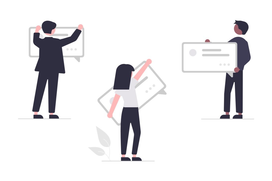
Communication tool for architecture in VR

Bridge the communication gap within architecture projects using VR
ROLE
VR developer
Interaction designer
UXUI designer
TEAM
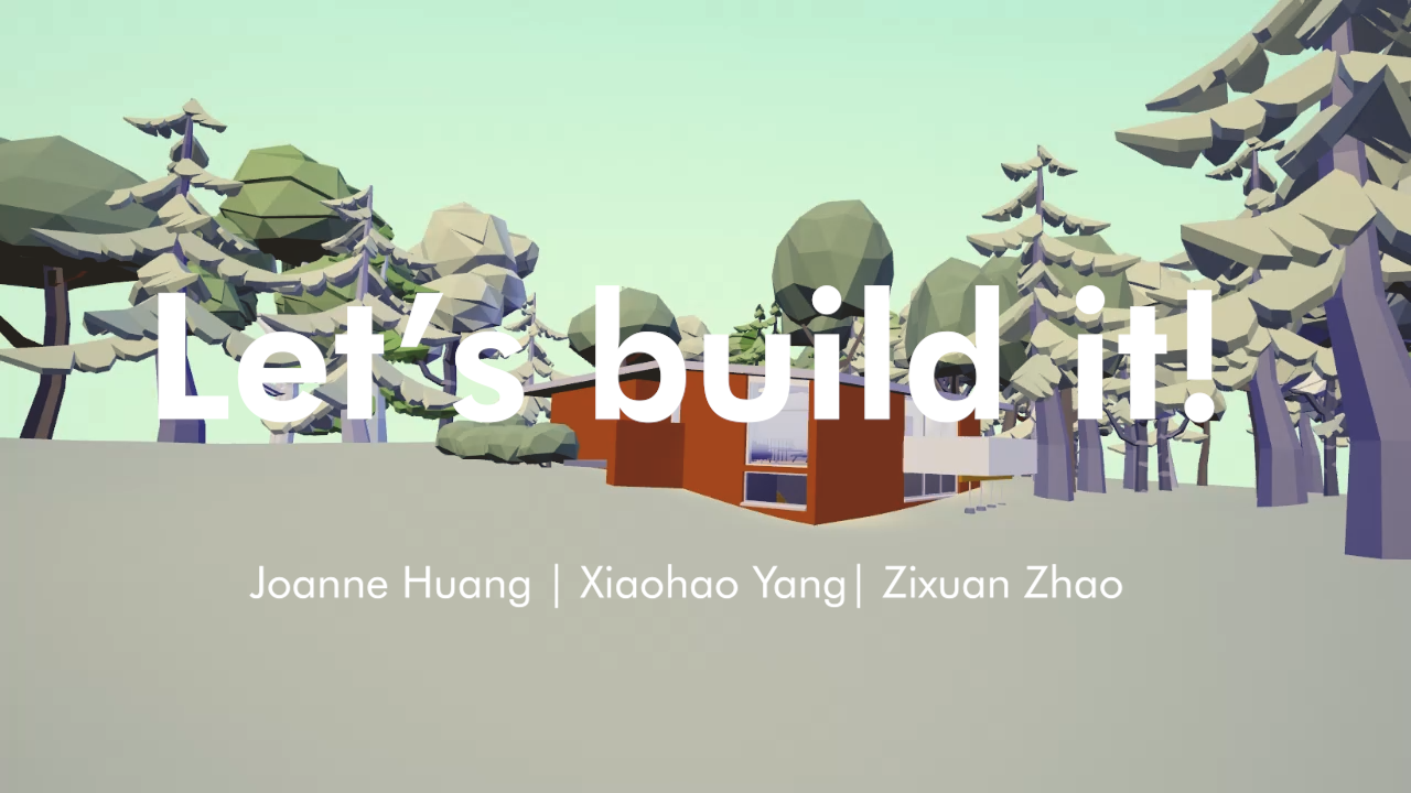
Joanne Huang
Xiaohao Yang
Ziyuan Zhao
TIMELINE
Feb 2022 - April 2022
2 month
SKILLS
Product thinking
Prototype
Interaction design
Game development
UX research
UX design
UI design
TOOLS
Unreal Engine
Figma
Adobe Photoshop
Adobe Premiere
Adobe After Effect
Rhinoceros
Blender
ABOUT THE PROJECT
During the winter of 2022, I teamed up with Xiaohao Yang and Ziyuan Zhao in an architecture elective where we explored using XR technology to enhance architecture tools.
In the research phase, I conducted need-finding interviews with three architectural designers. Moving into the design phase, I crafted storyboards through sketching and a low-fidelity prototype using Figma. These were subsequently used to assess usability with three participants, allowing us to iterate the project features and interfaces based on their feedback.
For the development phase, I created a mid-fidelity prototype and optimized the user interface design based on the user experience (UX) problem we identified. Lastly, I restructured the code to enhance performance, culminating in delivering the Minimum Viable Product (MVP) and a demo video.
KEY ACCOMPLISHMENTS
Formulate the project statement and goals with interviews
Led need-finding interviews with three architectural designers, gaining valuable insights to inform the project's direction and user requirements.
Design, validate, and iterate the product design using sketches, storyboards, and prototypes with Figma
Created storyboards, a low-fidelity prototype, and a mid-fidelity prototype, using feedback from three participants to iteratively refine the project's features and interfaces for improved usability.
Develop the Minimum Viable Product (MVP) and produce a demo video with Unreal Engine
Designed the user interface (UI) based on identified user experience (UX) issues, restructured the code for enhanced performance, and delivered the Minimum Viable Product (MVP) along with a demo video using Unreal Engine


Challenges & Learnings

Opportunities in technical challenges
I started my first XR interaction project and became proficient in Unreal Engine's blueprint development. I discovered that visual scripting in Unreal Engine is similar to what I've done in architectural design with Grasshopper. However, I learned that pure blueprints can lead to performance issues when the project scales. To address this, I decided to learn C++ within Unreal Engine to create not just prototypes but also future MVPs.

Invite feedback regularly
I tried a new approach by involving users in testing prototypes at every stage. I noticed that user feedback significantly improved the product and increased user engagement. This shift in mindset taught me the importance of user-centered design and the value of involving users in the process.
Problem
Outdated design-sharing leads to communication problems in architecture
In the architecture industry, there's a big issue: communication breakdowns in complex construction projects. These happen because there are many different people involved, like architects, clients, engineers, contractors, and consultants, and they often struggle to understand each other.
Context

More complex projects
Today's architecture projects have grown increasingly complex, involving many stakeholders, including architects, clients, engineers, contractors, and consultants. This complexity often leads to communication breakdowns, causing project delays and additional costs. Traditional design-sharing methods like 2D drawings and physical models are inadequate for modern projects.

Diverse file formats and software preferences
From a business perspective, the architecture industry struggles with communication challenges caused by various file formats and software choices professionals use. Professionals use a range of formats like rvt, 3md, PDF, CAD, and various software tools such as Revit, Rhino, Enscape, Photoshop, and Illustrator. This diversity frequently results in mistranslations and inefficiencies when sharing information.
Goal
Bridge the communication gap within architecture projects using VR
We aim to leverage VR technology to bridge communication gaps within architecture projects, enhancing collaboration, reducing misunderstandings, and ultimately delivering exceptional results that meet or exceed client expectations.
Success metrics

Short-term:
Collaboration efficiency
Calculate the decrease in the time needed for agreement between project stakeholders compared to traditional methods.

Medium-term:
Error reduction
Measure the reduction of mistakes in design, requests for changes, and expenses for fixing errors in architectural projects by using virtual reality for communication.

Long-term:
Client s
atisfaction
Regularly survey clients to gauge their satisfaction with project communication and deliverables to improve client feedback scores consistently.
Design process
Design process
RESEARCH
Need-finding Interviews

“Our drawings should have already told the entire stories.”
— Participant 2, Architect

“There’s always something wrong or missing in the drawings.“
— Participant 3, Contractor

“I hope the glossy images match up with the completed bulidings. “
— Participant 1, House owner
Key findings
Struggling mainly in the process of communicating around 3D concepts
Need-finding interviews revealed varied expectations and challenges among different user roles in the architecture industry, mainly revolving around the struggle to translate 3D concepts into 2D representations.
Ideation
Use VR to provide different view modes for different users and use case
Building sequence: Review the construction step by step, emphasizing materials and details.
Visit tour: Place the rendering images in space to help viewers align their imagination.
Story mode: Place text in the world to help designers deliver design concepts.
Design process + Takeaways
Storyboard and User flow
Takeaways
Users could scale themselves bigger or smaller, just like the creation mode in Meta’s Horizon Worlds.
-> Users shared that they can easily lose patience, so we stick to a permanent 1:1 scale.Users could switch from viewing in the first perspective to the isometric perspective.
-> Users felt inconsistent switching perspectives as they need to rebuild their understanding of how to move and where they are, so we remove the feature.
Users could learn more about design concepts with annotated texts in the virtual space by entering the “More about the house“ mode.
-> Users said they have a better experience reading texts in the physical world. After understanding that reading text in VR can easily cause motion sickness, we remove this mode.
Interaction lo-fi prototype
Takeaways
Users want to know how many steps are left.
-> Add a counter and show the progress in UI.
Not all users know all the materials.
-> Simplify the buttons to two arrows, moving to the next step and moving back one step.
Users felt annoyed that hint text randomly showed up in the world.
-> Remove the hint text in the virtual world.
UI lofi-prototype phase 1


Takeaways
Users often accidentally hit the quit button in the center bottom.
-> Move the quit button to the top right to avoid.
Users said the solid background color blocks their view.
-> Change the background from a solid color to a transparent color so users can see through.
The visit tour buttons on the map are too small to target and hit.
-> Change the selection way from small pins on a map to big cards with thumbnails.
UI lofi-prototype phase 2


Takeaways
Users thought their quit button was closing the UI instead of leaving the mode.
->Change the icon from a cross to a back arrow and move it to the left top button, using the 2D interface rules.
The red color is difficult to recognize in the VR scene as the background is colorful and the house brick is red.
-> For the buttons, add a solid fill background color to make it easier to read.
FINAL DESIGN
Demo
FINAL DESIGN