
AR Inclusive Game
PRODUCT MANAGER & UX DESIGN & DEVELOPMENT • AR & MOBILE

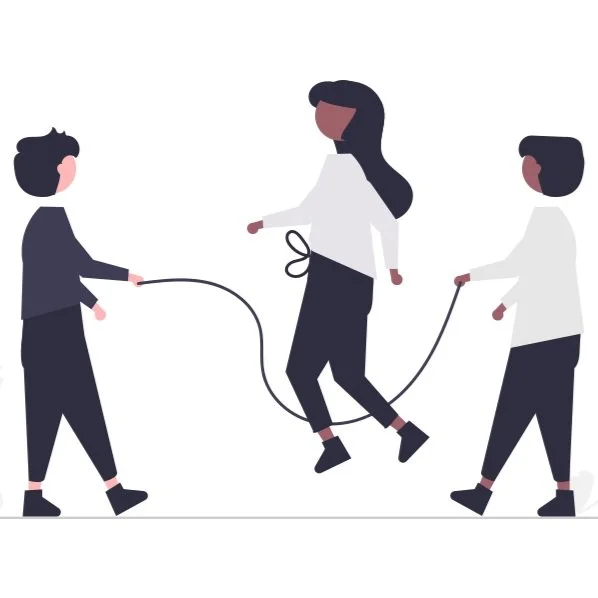
Make play and exercise inclusive and fun for people of all abilities
ROLE
Product manager
Front-end developer
UX and Interaction designer
TIMELINE
Jan 2022 - May 2023
1.5 yrs
ADVISORS
Dr. Roland Graf
Dr. Michael Nebeling
Dr. Hun-Seok Kim
TEAM
1 PM ← I’m here
4 Engineer (SW, IoT, CV) ← I was here
3 UXD ← I was here
2 Game developer
2 Product strategist
SKILLS
Product management
Product thinking
Prototype
Game design
Interaction design
Front-end development
Game development
TOOLS
Figma
Sketches
Miro
Fabrication
RFID
ROS 2
Unity
React.js
ABOUT THE PROJECT
In the winter of 2022, I had a dual role in a project that started from scratch (0->1), from research to product. I began as a UX and interaction designer and later took on the role of Project Manager.
My journey started with brainstorming game ideas, creating basic prototypes for testing, and making sure they fit with our system design. Then, I crafted the game's user experience (UX) and built the user interface (UI) for the web-based companion app to provide accessibility and adaptivity following our customer research. This involved using basic and advanced prototypes to iterate and lead the front-end development. At the same time, I also led the effort to redesign and improve our product's landing page, with a particular focus on marketing strategies for our upcoming launch.
KEY ACCOMPLISHMENTS
Shape product direction using insights from customer discovery research and expert advice
Led cross-functional teams, including computer vision, engineering, user experience design, and product strategy, to execute the research-to-product roadmap effectively.
Design and research adaptive game
Led the conceptualization and playtesting of game ideas while ensuring alignment with existing system design.
Design and develop the front-end part of the web-based companion app
Designed and developed a web-based companion app using React.js under the ROS2 structure, integrating with computer vision and Unity, to increase accessibility and adaptivity of AR game interactions.
LATEST DESIGN
Cross-Device Experiences


LATEST DESIGN
How to play?


LATEST DESIGN
How it works?

Problem & Goal
Make play and exercise inclusive and fun for people of all abilities
In traditional sports, people with disabilities that affect their movement often struggle to participate fully with their friends who don't need mobility aids. These challenges limit their involvement and can impact their sense of belonging and enjoyment in activities.


Success Metrics
User engagement
We'll track user engagement through metrics like participant count, frequency, and activity duration. Increased engagement shows user involvement and enjoyment.

Inclusivity
To measure inclusivity, we'll track diverse participants and their feedback on program accessibility. Success lies in accommodating mobility and health needs and receiving positive feedback.

Health outcomes
Participants' health progress will be tracked to evaluate success. This includes improved fitness, strength, and cardiovascular health, promoting a healthier lifestyle.
Constraints

Ambiguity and lack of clear goal
The project evolves from a research paper to a customer-facing initiative, and this 0-to-1 development process lacks a well-defined goal, hampering effective progress and the achievement of objectives.

Broad domain of knowledge
The project covers a wide range of knowledge areas, including computer vision, RFID player location tracking, and Bluetooth signal utilization. Managing and maintaining focus within this broad scope poses a challenge.

Frequent team member changes
Team members change every quarter, which can disrupt project continuity. A robust knowledge transfer and onboarding process ensures consistent performance and productivity.
Design Process
Design Process
GAME DESIGN
Ideation Sketches
GAME DESIGN & RESEARCH
Paper Prototype


To test our game ideas, we use a fast and affordable method called "quick-and-dirty" usability testing. We create simple paper models of our game concepts, making it simple to collect helpful user feedback. This hands-on approach mimics the user experience and helps us assess how easy the game is to use, navigate, and enjoy. It efficiently directs us towards creating more user-friendly game designs.
Key findings → Next steps
Physical distance for safety and detection → Design games need players to keep a distance
To ensure the safety of players and enhance detection efficiency, players must maintain a specified physical distance during gameplay.
Game too complex → Simplify the game rules
Users experienced challenges in understanding the game, taking over five minutes to grasp its mechanics.
Enhancing maneuverability and visibility → Avoid using projection for essential messages
Participants encountered difficulties regarding maneuverability and visibility, mainly when sitting on chairs.
GAME DESIGN
Interactive Prototype

We use Figma to craft an interactive prototype that responds to user feedback. Our main goals are to simplify the game, ensure distance for efficient detection, and minimize reliance on projections for key messages, enhancing visibility for chair-bound players.
GAME DESIGN & RESEARCH
Table Prototype


We use Unity to develop the game, creating a tabletop setup with RFID cameras and mini projectors for player tracking via computer vision. Lego figures represent users within this setting, which is then used for usability testing.
Key findings → Next steps
Players love the game
On average, players spent about 6 minutes playing the game, showing a high level of interest and immersion.
Easy to grasp
Players quickly understood the game, typically within just 8 seconds.
Improve the game with peri-personal circle settings
Two critical factors affecting the user experience were identified - the speed of the ball and the presence of peri-personal circles. These elements play a crucial role in shaping the game's satisfaction.
Facilitator boosts inclusivity → Create a companion app for users to adjust settings
When someone helped tweak the game settings, it made the gaming experience better for everyone, adapting to different abilities. This highlights the need for a user-friendly companion app that allows users to fine-tune settings for ongoing satisfaction.
COMPANION APP RESEARCH
Developer Interface Audit Workshop
We reviewed our developer interface to identify areas for improvement. This includes carefully examining the interface and identifying essential settings. This helps us make improvements that make it easier for developers and end-users to use our platform.
Key findings → Next steps
Complex Customization → Simplify the UX and UI
The current developer-centric design of the application, characterized by an abundance of customizable options, may overwhelm users. Enhancing the user experience necessitates a simplification of both the UX and UI.
Unclear Text → Use illustrations and icons
Ambiguities in the application's terminology and textual content pose potential challenges for users. The strategic incorporation of illustrations and icons is advised to optimize user comprehension.
Confusing Numbers → Create preview scenes
Users encounter difficulties in deciphering the significance of numeric attributes within the application. The introduction of preview scenes, enabling users to interact with these attributes and observe their impact, holds the potential to enhance user understanding and engagement.
PRODUCT RESEARCH
Business Model Canvas
We used the Business Model Canvas to identify potential customers, clarify our values, analyze costs, and determine revenue streams. Most importantly, this framework guided us in defining our growth direction. It provided a comprehensive roadmap for strategic decision-making, ensuring that we not only operate effectively but also progress towards our growth objectives.
PRODUCT RESEARCH
Customer Interview
Later, we conducted extensive customer interviews, a comprehensive process designed to unveil the true needs of our users across various stakeholders. We examined their expectations for our products, delved into crucial user experience considerations, and synthesized all gathered insights. This exhaustive approach allowed us to compile a comprehensive list of actionable items.
Key findings → Next steps
Facilitator control preference → Create a facilitator-centric companion app
The interviews revealed a strong preference for facilitators to have control over games, highlighting the importance of facilitating instructor involvement in the gaming experience.
Cost sensitivity → Implement a web-based app
Cost was consistently highlighted as a significant concern during the interviews. To address cost concerns, we will focus on developing a web-based application that enables easy setup without additional devices, ensuring a more cost-effective and accessible solution.
Lack of awareness about our project → Create a landing page, brand identity, and visual design system
A striking 100% of interviewees expressed a lack of knowledge about Airplay, indicating a need for awareness-building efforts to familiarize potential users with the product.
COMPANION APP DESIGN
Wireframe & Flow
We built an interactive wireframe and flow, a foundational internal testing prototype. In this version of the design, we foster creative innovation by introducing new ideas, such as an "idle mode," "pairing system," and a precise categorization of settings into "primary" and "secondary."
Key findings → Next steps
Slider Handling Challenge
Multiple slider handles can lead to user errors; a more intuitive design is needed to prevent mistakes.
Simplified Primary Settings
Primary settings still have too many options, making it hard for users to understand; simplification is necessary.
Accessibility Concerns
The use of color in the design may create accessibility problems, especially for users with color blindness. Inclusive design and alternative cues are vital for accessibility.
COMPANION APP DESIGN & RESEARCH
Iteration v1
We started our interface design process with the first iteration, using the Figma prototype and React.js to build it. Later, we conducted usability tests with people who had never heard of our product. These tests were crucial to ensure that our companion app effectively helped them understand the game setup and flow.
Key findings → Next steps
Terminology Confusion → Review the content
60% of users found the terminology confusing, emphasizing the need for clearer and more user-friendly language.
Overwhelming Game Settings → Provide default settings
The complexity of the game settings was identified as an issue, highlighting the need for simplification and improved user-friendliness.
Kid-Friendly Aesthetics → Make the theme and style more fun and playful
There's an opportunity to make the theme and style more appealing and accessible for younger users based on feedback.
COMPANION APP DESIGN
Iteration v2
We incorporated user feedback from the first iteration into our design process. This included introducing a "paring" button user flow, catering to facilitators in configuring buttons for players. Additionally, we integrated a playful, gamified theme to enhance user engagement. To simplify the user experience, we relocated detailed settings to a dedicated page, leaving only essential runtime and difficulty options accessible for a smoother initial setup. These changes reflect our dedication to user-centric design and streamlined usability.
LANDING PAGE DESIGN
Sitemap
I began the landing page design process by crafting a sitemap. This sitemap helped initiate discussions within the team about the essential elements and content priorities, ensuring clarity in the page's structure and content focus.
Key findings → Next steps
CTA overload → Reprioritize content
The initial design contained an excessive number of call-to-action buttons. To address this, we must prioritize the most important actions and categorize them as primary and secondary buttons.
“Contact us“ should always be visible → Make it the main CTA button on the top navigation bar
To make it easier for users to reach us, we should add a "Contact Us" button to the fixed navigation bar, ensuring quick access to our contact information throughout the site.
LANDING PAGE DESIGN
Wireframe
I gathered input from the team and created a wireframe to seek additional feedback on the project's layout and structure. This collaborative process ensures that our design aligns with our goals and benefits from the expertise and perspectives of our colleagues, making our final product more refined and effective.